


Niagara Launcher ‧ Home Screen
Peter Huber
I noticed the difference with Niagara Launcher almost immediately: my home screen stopped feeling like a page I had to manage and started feeling more like a quick access point. Instead of arranging icons across several panels, I could reach apps through a clean alphabetical edge list, with the most important choices kept close at hand. That sounds simple, but it changes how I use my phone. I spend less time swiping between screens and less time deciding where an icon belongs.
My overall view is that this is one of the most convincing alternatives to a conventional Android home screen if you value speed, calm presentation, and one-handed use over endless visual customization. It is a free personalization app from Peter Huber, aimed at people who want their launcher to get out of the way. It also has a 4.7 average from around 176 thousand ratings, which matches my impression that its focused design has found a large audience.
Why the minimalist layout works so well
The central idea is not merely “fewer icons.” Niagara changes the basic relationship between the home screen and the app drawer. Your applications are presented as a vertical list, and the alphabet running along the side gives you a direct route to a particular letter. I found this much more practical than repeatedly swiping across pages, especially when I already knew the name of the app I wanted.
The layout is particularly comfortable when I am holding the phone in one hand. The important interaction stays near the edge, so reaching an app does not require stretching toward the top corners or shifting my grip. On a large phone, that small decision matters more than decorative widgets ever have for me. The screen feels less crowded, and the launcher gives my thumb a clear job rather than asking it to search through a grid.
There is also a useful psychological benefit. A traditional home screen often encourages me to place apps where I might need them, then gradually fills with folders, shortcuts, and forgotten icons. Niagara makes that kind of accumulation less tempting. I can still access everything, but the interface does not constantly display every possible distraction. For someone trying to keep the phone focused, that restraint is more meaningful than a wallpaper change.
Latest News

Uber Eats Under Pressure: What Happens When Delivery Goes Wrong

How QR & Barcode Scanner Adapts to Android and iOS Innovations

Why Waze Navigation & Live Traffic Is Your Essential Travel Companion

CapCut Mastery: Unleash Hidden Features for Pro-Level Editing

How OS Updates Enhance Roblox Adventures

Teacher Simulator: Exam Time Turns Quick Classroom Judgments into a Repetitive Loop
The app sits naturally in the personalization category, although I would describe it as a workflow tool as much as a visual one. Its goal is not to imitate a desktop, recreate another phone brand’s interface, or provide a giant collection of themes. It gives me a different starting point for everyday actions, and that makes the choice of launcher feel more substantial than a cosmetic swap.
A realistic morning-to-evening workflow
My most useful test was an ordinary workday. In the morning, I opened the launcher and went directly to the calendar rather than hunting through a folder. Later, I reached messaging, maps, and music from the same alphabetical structure. When I needed an app I rarely use, I did not have to remember which page I had assigned to it months earlier. I simply moved along the letter strip and selected it.
That workflow is especially effective when the app name is easy to remember but its visual icon is not. I often recognize “Recorder” or “Transit” faster as a word than as a small symbol. Niagara takes advantage of that habit. It turns app retrieval into a lightweight reading task, and for me that is more reliable than scanning a colorful grid.
Gallery
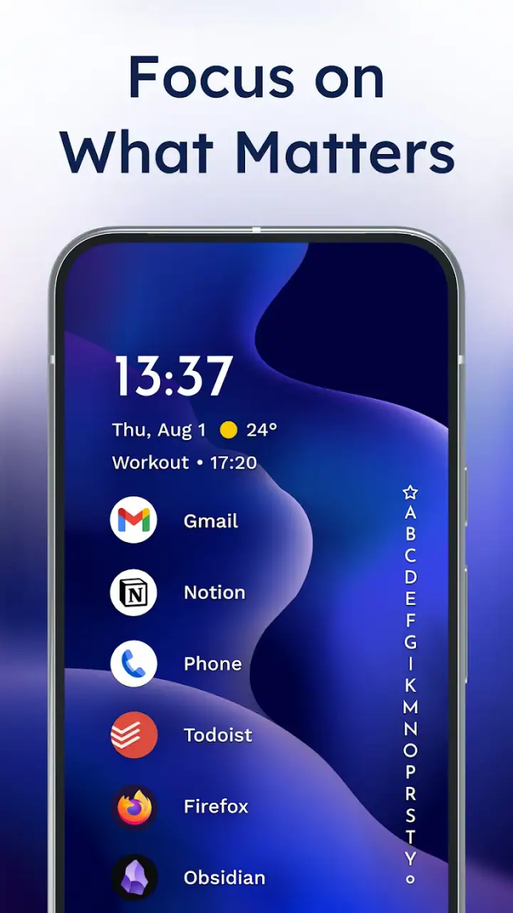
The trade-off appears when I want to compare several apps at once. A grid gives me a broad visual overview, while the list is more linear. If I am choosing between multiple photo editors or checking which games I have installed, the conventional arrangement can be faster because I can see many icons simultaneously. Niagara is strongest when I know what I want, not when I am browsing a collection.
Small adjustments that make the launcher more practical
I would not use the app effectively by leaving every application equally prominent. My first useful adjustment was deciding which apps deserved quick access and which could remain in the full list. Keeping only genuinely frequent tools close by prevents the minimalist screen from becoming another crowded dashboard. The important point is to treat the home screen as a shortlist, not as a complete inventory.
A second tip is to give the arrangement time before judging it. The first few minutes can feel strange if I am used to tapping a familiar icon in a fixed grid. After a short adjustment period, the alphabetical movement becomes muscle memory. If I constantly switch back to a conventional launcher during that period, I never really discover whether the new method suits me.
I also found it helpful to think in terms of tasks rather than app categories. Instead of filling the first area with every social application, I keep the tools I use during a particular part of the day easy to reach. That makes the launcher feel less like a filing cabinet and more like a simple command center. It is a subtle distinction, but it is where the design becomes genuinely useful.
For people who want a quieter phone, I would go further and keep the visible choices deliberately narrow. The benefit is not that Niagara prevents me from opening distracting apps; it does not replace self-control. Its benefit is that it removes some of the visual prompts that normally invite me to open them without thinking. The strongest feature is the reduction of friction for useful actions while adding a little friction to aimless browsing.
What the large user base tells me—and what it does not
The app has passed ten million installs, and its rating is supported by roughly 176 thousand ratings and 4.6 thousand written reviews. Those figures suggest that the concept is not a niche experiment limited to a handful of enthusiasts. More importantly, the scale makes sense after using it: the interface is easy to understand once its central list replaces the familiar grid.
It is available at no upfront cost and is rated for Everyone, so trying it does not require a major commitment. The current release is version 1.15.11, and it runs on Android 5.0 or later. Optional in-app purchases range from $0.99 to $42.99 per item. I would approach those purchases as a way to support or extend the experience rather than as a reason to install it; the basic idea is already clear without turning the launcher into a shopping exercise.
One detail I value is that the app is presented without advertising. That matters more in a launcher than it might in a casual utility because the home screen is something I see dozens of times a day. An ad, promotional panel, or noisy recommendation layer would undermine the entire point. Here, the clean starting screen remains part of the product’s identity rather than becoming a space for interruptions.
The weakness: simplicity can become a limitation
My main criticism is also the source of the launcher’s appeal. Niagara does not try to satisfy every possible Android preference. If I want a heavily customized grid, elaborate folder structures, multiple home pages, or a desktop-like arrangement of widgets, a more traditional launcher is likely a better fit. The app asks me to accept its method instead of giving me a blank canvas with unlimited controls.
That can create friction for people who organize their phones visually. Some users remember an app by its position, color, or neighboring icons. Niagara replaces those cues with names and alphabetical navigation. I found the change efficient, but someone with a carefully designed multi-page setup may initially feel that useful spatial memory has been taken away.
There is another practical compromise around discovery. A grid encourages accidental rediscovery: I may notice an old app because its icon catches my eye. The list is more purposeful, which is good for focus but less rewarding when I want to browse. If your phone is also a place where you explore, compare, and stumble across forgotten tools, the launcher may feel a little too disciplined.
Widgets and visual information also need a different mindset. I prefer Niagara when I want a clean entry point, but people who depend on a dense arrangement of calendar details, weather panels, controls, and live information may find the design less natural than a standard launcher. I would not choose it solely because I like minimalist wallpapers; the real question is whether I want the home screen to show less at a glance.
Finally, the transition itself is a cost. Replacing a familiar launcher changes a basic phone habit, so the first impression may be less smooth than the finished experience. I had to stop reaching for the old grid and start trusting the list. That is not a technical flaw, but it is a real adoption hurdle, especially for someone who wants immediate familiarity rather than a new interaction pattern.
Who should install it, and who should skip it
I recommend Niagara to people who regularly lose time looking for apps, use a large phone one-handed, or feel that their home screen has become visually noisy. It is also a strong choice for users who know app names quickly and prefer a direct route over a decorative interface. Students, commuters, and anyone moving between tasks can benefit from having the same predictable access method everywhere on the device.
It suits a person who wants to make the phone feel less demanding without pretending that a launcher can solve every attention problem. The clean layout can support better habits because it removes some unnecessary visual stimulation. I would especially suggest it to someone who has tried deleting icons or creating folders but still ends up with several cluttered pages.
I would skip it if your ideal home screen is a carefully composed dashboard. Users who want many widgets visible at once, extensive icon placement control, or a familiar page-by-page system will probably be happier with the launcher already supplied by their phone or with a customization-focused alternative. Niagara is not a universal replacement; it is a deliberate change in priorities.
I would also hesitate to recommend it to someone who frequently browses apps by appearance. If you cannot remember names and rely on recognizing an icon’s shape or location, the alphabetical list may slow you down. The same applies to households where several people share a device and each person expects a conventional layout. A system that feels elegant to one user can feel restrictive to another.
How it compares with the usual Android approach
The default Android launcher generally offers a familiar compromise: a home screen for favorite apps, one or more pages for shortcuts, and an app drawer for everything else. That arrangement is immediately understandable and works well for mixed habits. Niagara is less neutral. It removes the need to maintain several pages, but in exchange it asks me to use a single, more opinionated navigation model.
Compared with a customization-heavy launcher, Niagara gives up breadth for consistency. Other launchers may be better when the point is to redesign every visual detail, create elaborate gestures, or build a dashboard around widgets. Niagara makes more sense when I would rather spend time using the phone than tuning it. Its customization is valuable when it supports speed and calm, not when it becomes a hobby in its own right.
Compared with a distraction-focused launcher, it shares the goal of reducing visual noise but takes a different route. A distraction-minimizing tool may emphasize limits, monochrome presentation, or strict access rules. Niagara mainly changes how I reach apps and what the first screen asks me to look at. That makes it less forceful, which is good for people who want a gentler adjustment, but less suitable for anyone seeking firm restrictions.
The best comparison is therefore not “more features versus fewer features.” It is “open-ended arrangement versus intentional flow.” I prefer the latter when my phone is a tool for communication, navigation, scheduling, and quick utilities. I prefer the former when I am managing a visual workspace or want my launcher to express a particular style.
Details worth considering before making the switch
Because it is a launcher, the app becomes part of the phone’s basic rhythm rather than something I open occasionally. That means the right choice depends on repeated comfort, not on whether the first screen looks attractive in a screenshot. I would test the way I actually retrieve apps: during a rushed morning, while walking, and when I need an unfamiliar application. Those moments reveal more than a calm setup session.
I would also decide in advance which apps deserve priority. If everything is treated as equally important, the home screen loses its purpose. A short list of everyday tools makes the experience feel fast; a long list of exceptions makes it feel like another configuration project. This is one of the few launchers where restraint from the user is part of getting the best result.
People may reasonably ask whether they need to pay to understand the product. They do not need to make a purchase simply to try its central workflow, since the app is free to install. The optional purchase range is worth keeping in mind, but I would evaluate the launcher first on whether the list-based approach feels natural. A payment should follow genuine long-term value, not curiosity during the first setup.
Another sensible question is whether an older Android phone can use it. The minimum requirement is Android 5.0, so the compatibility range is broad. Still, I would judge the experience on the particular device as well as the operating system, especially if the phone has a heavily modified interface or unusual navigation controls. The launcher’s idea is simple, but comfort depends on how naturally it fits the rest of the phone.
My final recommendation
After using it as a daily home screen, I see Niagara Launcher as a focused redesign rather than a collection of cosmetic tweaks. Its best achievement is making app access feel intentional: I read the name, move to the right letter, and open what I need. That process is quick, easy to perform with one hand, and less visually distracting than a crowded collection of pages.
Its limitations are clear and important. It is not the right tool for a widget-heavy dashboard, a highly decorated grid, or users who depend on visual placement. The list can feel less inviting when I want to browse, and the change from a conventional launcher takes some adjustment. Those are not defects I would hide, because they define the audience that should choose it.
For me, the balance works. The free Personalization app from Peter Huber has a clear point of view, avoids advertising, and delivers a calmer way to reach the rest of the phone. With more than ten million installs and a strong 4.7 average, it has clearly connected with many Android users. If your current home screen feels like clutter you have learned to tolerate, this is one of the rare launcher changes I would genuinely recommend trying.
FAQs for Niagara Launcher ‧ Home Screen
What is Niagara Launcher and how does it differ from other launchers?
Niagara Launcher is a minimalist Android home screen app designed to offer a streamlined and efficient user experience. Unlike traditional launchers, it emphasizes simplicity by presenting your apps in a clean list format, making it easy to access your most-used apps with one hand. Its adaptive design and focus on usability set it apart from other feature-heavy launchers.
Does Niagara Launcher support customization and widgets?
Yes, Niagara Launcher offers several customization options to tailor the home screen to your liking. While it may not support traditional widget placement like other launchers, it allows for adding essential widgets that integrate seamlessly. The launcher prioritizes simplicity, ensuring that any customization enhances usability without cluttering the screen.
Is Niagara Launcher compatible with all Android devices?
Niagara Launcher is compatible with most Android devices running Android 5.0 (Lollipop) and above. However, performance may vary depending on the device's specifications. It's designed to run smoothly on both high-end and budget devices, offering a consistent experience across different hardware configurations.
How does Niagara Launcher handle app notifications?
Niagara Launcher integrates notifications directly into its interface, allowing users to view and manage them efficiently. Notifications appear beside the relevant app icon, providing easy access without the need to open the app. This feature helps users stay organized and ensures important information is promptly visible.
Is Niagara Launcher free to use, and are there premium features?
Niagara Launcher is available for free with basic features that cater to most users' needs. However, it also offers a premium version, Niagara Pro, which includes additional customization options, advanced features, and more frequent updates. Users can choose to upgrade to enhance their experience with extra functionalities.
Pros
- Intuitive gesture controls enhance usability.
- Customizable layout for personal preferences.
- Minimalist design reduces clutter.
- Quick access to favorite apps.
- Smooth performance with low RAM usage.
Cons
- Limited widget support for customization.
- No built-in weather widget available.
- Lacks advanced theme options.
- Limited icon pack support.
- No landscape mode for tablets.


